Chart patterns are an integral aspect of Technical Analysis, but they require some getting used to before they can be used effectively. A chart pattern is a shape within a price chart that helps to suggest what prices might do next, based on what they have done in the past. Chart patterns tend to repeat themselves and can give you a real competitive advantage in the markets if you are able to learn to recognize them.
The market is constantly changing. In many cases, it does not matter how you feel about it, it only matters how the market is going to feel about it.
Market sentiment is a critical indicator to predict price movements and make investment decisions. An easy way to gauge market sentiment is by looking at chart patterns. They tend to repeat themselves, and once you are able to recognize them, it becomes easier to strategize your entries and exits.
However, it is important to note that they are NOT a guarantee that the market will move in that predicted direction. It should only serve as a frame of reference for you to feel how the market moves.
The most important thing to remember when using chart patterns as part of your technical analysis is that they are not a guarantee that a market will move in that predicted direction, they are merely an indication of what might happen to an asset’s price. Below are some of the most common chart patterns studied by technical analysts as they appear on the Bitcoin/USD chart:
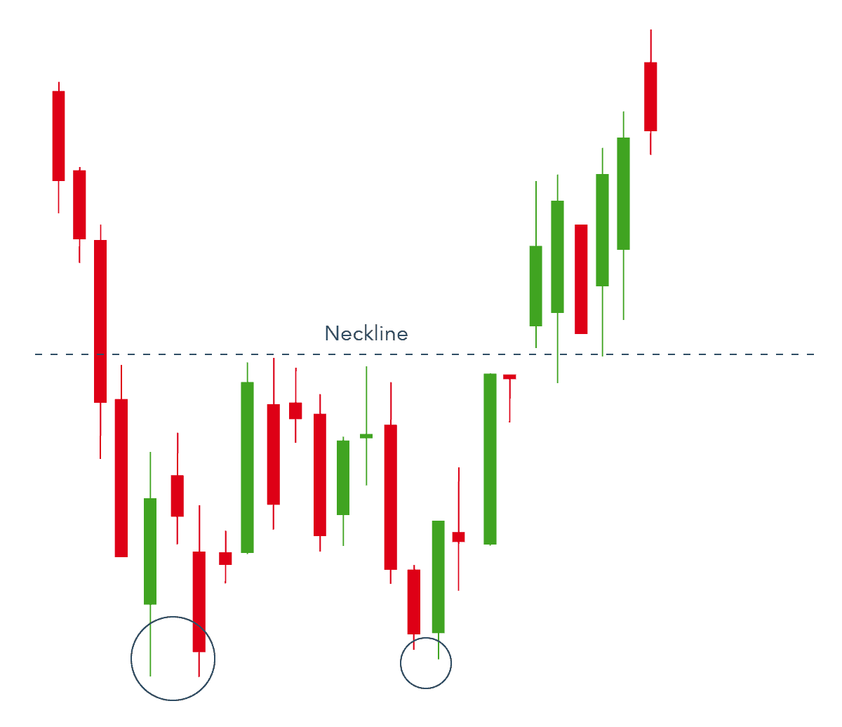
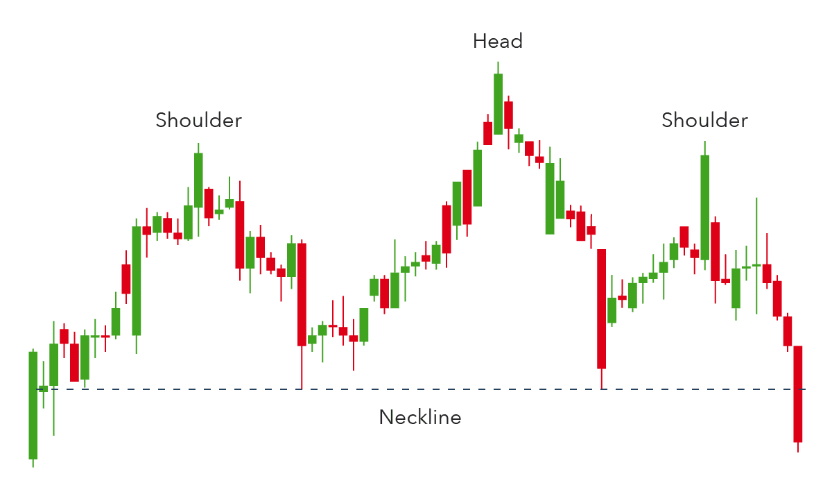
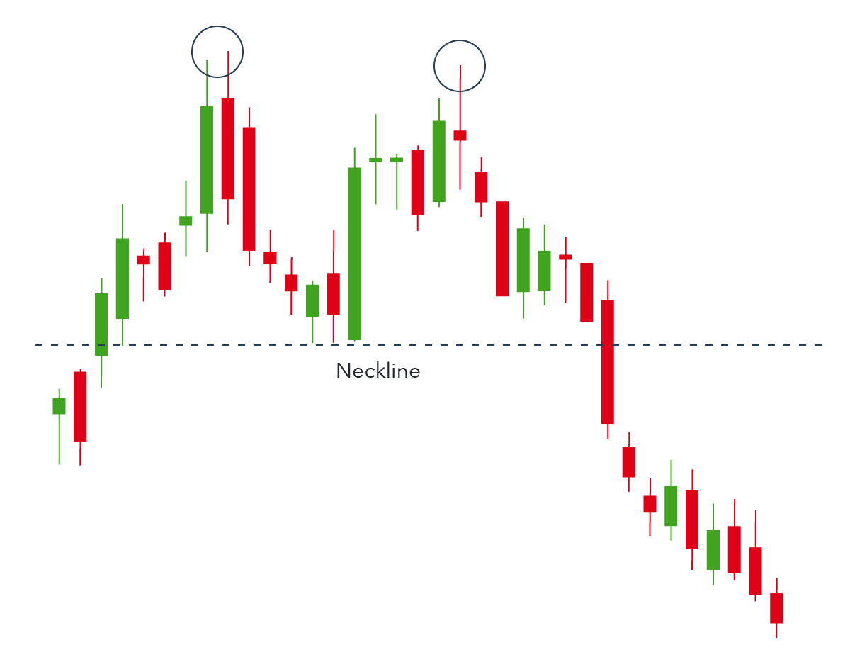
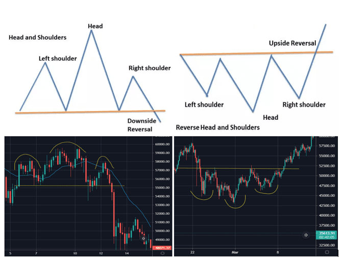
1. Head and Shoulders
This is a bullish and bearish reversal pattern that has a large peak in the middle and smaller peaks on either side. The Head and shoulders pattern is considered to be one of the most reliable reversal chart patterns. This pattern is formed when the prices of the stock rise to a peak and fall down to the same level from where they had started rising. Again, the prices rise and form a peak higher than the last peak and again it declines to the original base. Prices again rise to form a third peak, which is lower than the second peak and from here it starts declining to the base level. When the prices break the baseline with volume then a bearish reversal takes place.
Head and shoulders is a chart pattern in which a large peak has a slightly smaller peak on either side of it. Traders look at head and shoulders patterns to predict a bullish-to-bearish reversal. Typically, the first and third peak will be smaller than the second, but they will all fall back to the same level of support, otherwise known as the ‘neckline’. Once the third peak has fallen back to the level of support, it is likely that it will break out into a bearish downtrend.
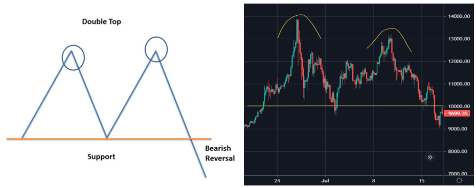
2. Double Top
A double top is a bearish reversal pattern that traders use to highlight trend reversals. The price forms a peak and retrace back to a level of support. It will then climb up once again before reversing back more permanently against the prevailing trend. A double top is a bearish pattern as it signifies the end of an uptrend and a shift towards a downtrend.
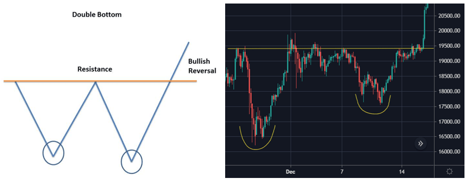
3. Double Bottom
A double bottom is a bullish reversal pattern that is opposite to the double top. Price forms a peak and then retrace back to a level of resistance. It then forms a peak once more before reversing back from the prevailing trend. A double bottom is a bullish reversal pattern, because it signifies the end of a downtrend and a shift towards an uptrend.
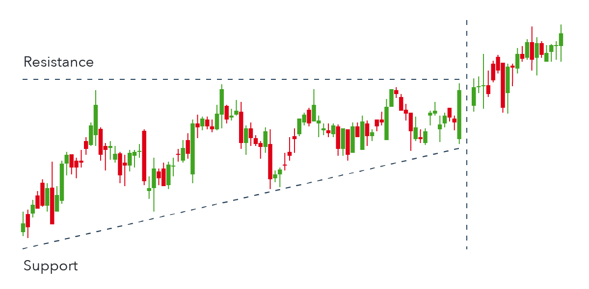
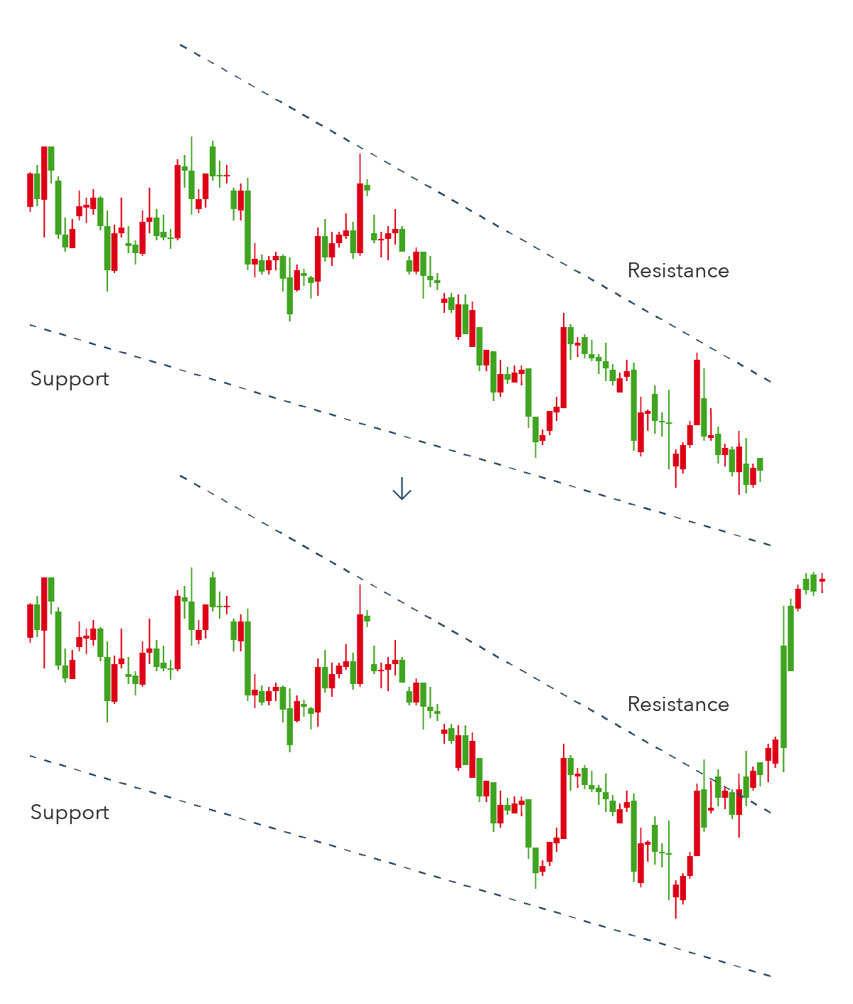
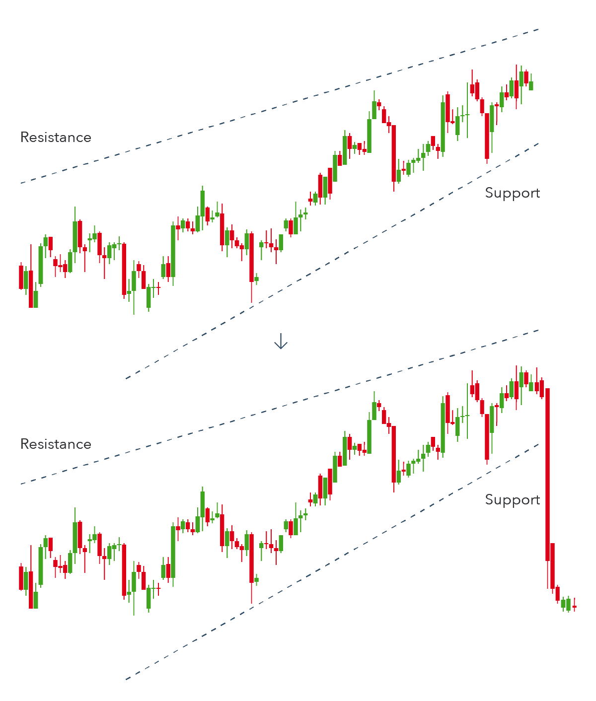
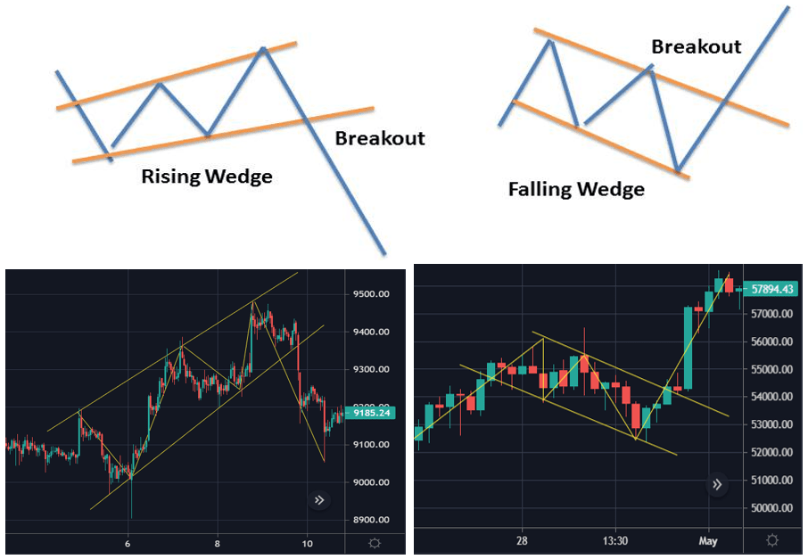
4. Wedges
Wedges are bullish and bearish reversal as well as continuation patterns which are formed by joining two trend lines which converge. There are two types of the wedge, rising and falling. Both rising and falling wedges are reversal patterns, with rising wedges representing a bearish market and falling wedges being more typical of a bullish market.
- A rising wedge is represented by a trend line caught between two upwardly slanted lines of support and resistance. This pattern generally signals that an asset’s price will eventually decline more permanently, which is demonstrated when it breaks through the support level.
- A falling wedge occurs between two downwardly sloping levels. This pattern is usually indicative that an asset’s price will rise and break through the level of resistance.
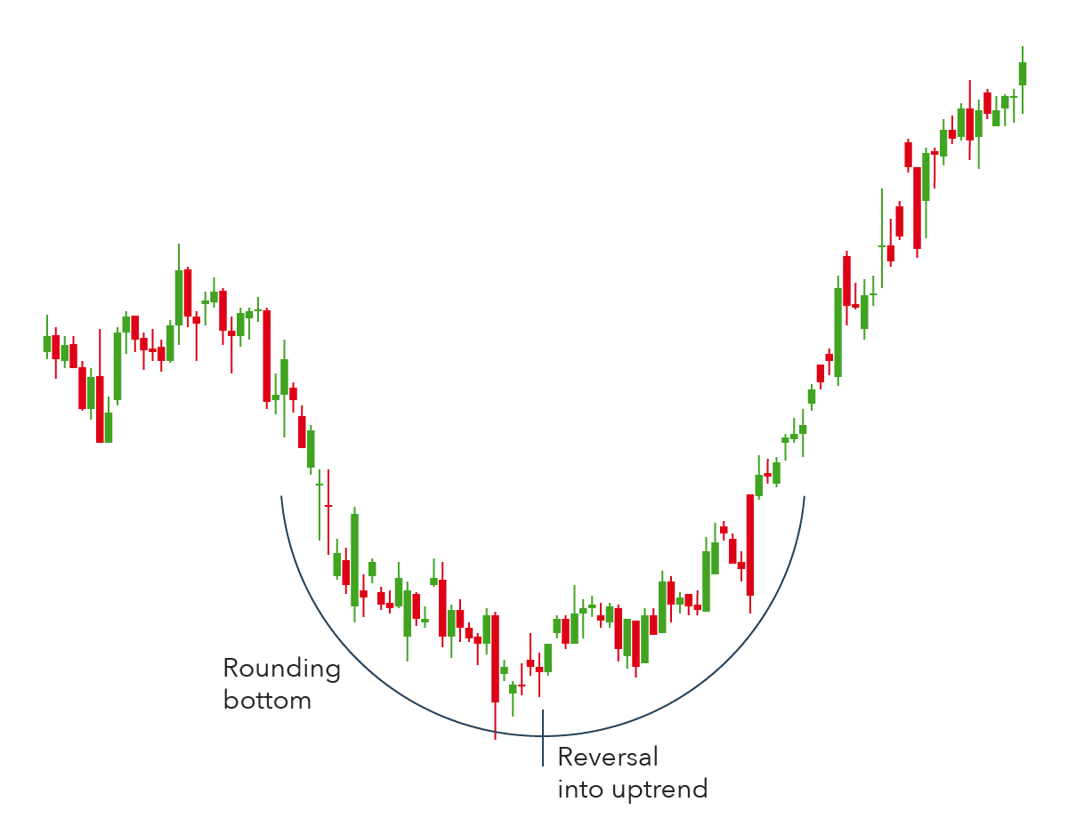
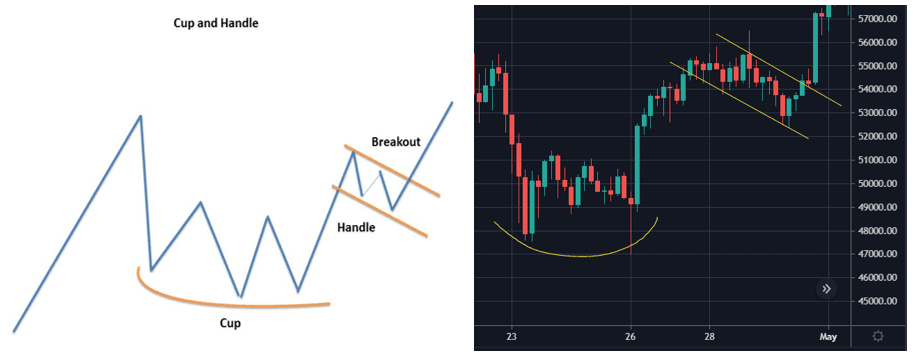
5. Cup and Handle
The cup and handle pattern is a bullish continuation pattern that is used to show a period of bearish market sentiment before the overall trend finally continues in a bullish motion. The cup appears similar to a rounding bottom chart pattern. Following the cup, the price of an asset will likely enter a temporary retracement, which is known as the handle because this retracement is confined to two parallel lines on the price graph. The asset will eventually reverse out of the handle and continue with the overall bullish trend.
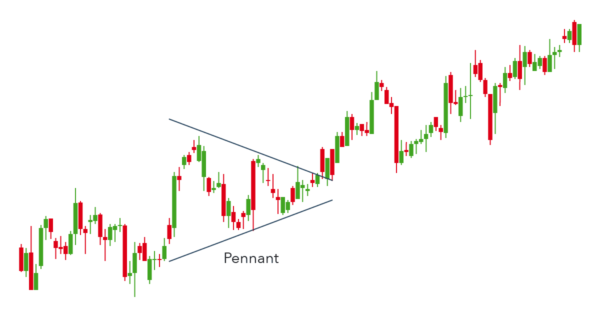
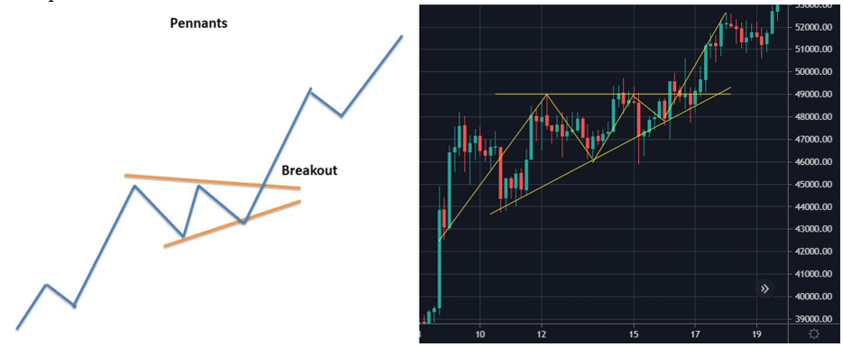
6. Pennants
A pennant pattern or a flag pattern is created when there is a sharp movement in the price either upward or downward. This is followed by a period of consolidation that creates the pennant shape because of the converging lines. Then a breakout movement occurs in the same direction as the big stock move. At the initial stock movement there is a significant volume which is followed by weaker volume in the pennant section and then rise in the volume at the breakout. Pennants can be either bullish or bearish, and they can represent a continuation or a reversal.
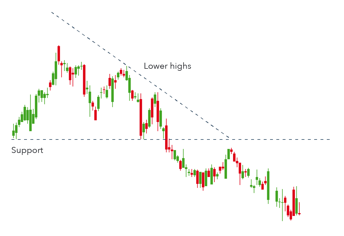
7. Triangles
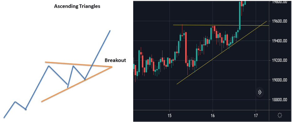
Ascending Triangles
The ascending triangle is a bullish continuation pattern which signifies the continuation of an uptrend. It can be drawn onto charts by placing a horizontal line along the swing highs, which acts as the resistance, and then drawing an ascending trend line along the swing lows, the support. Eventually, the trend breaks through the resistance and the uptrend continues.
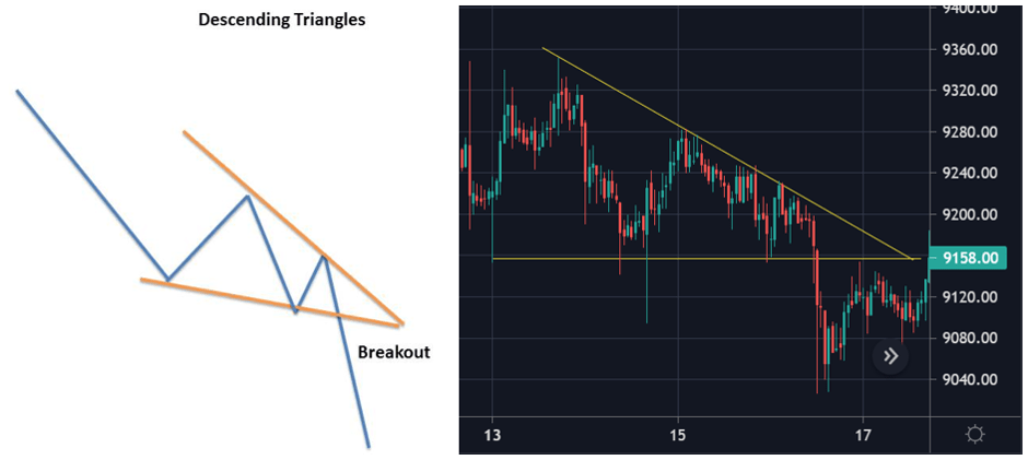
Descending Triangles
Just like the ascending triangle, the descending triangle is also a continuation chart pattern. The only difference is that it is a bearish continuation pattern and it is created during the downtrend. They generally shift lower and break through the support because they are indicative of a market dominated by sellers. Descending triangles can be identified from a horizontal line of support and a downward-sloping line of resistance. Eventually, the trend breaks through the support and the downturn continues.
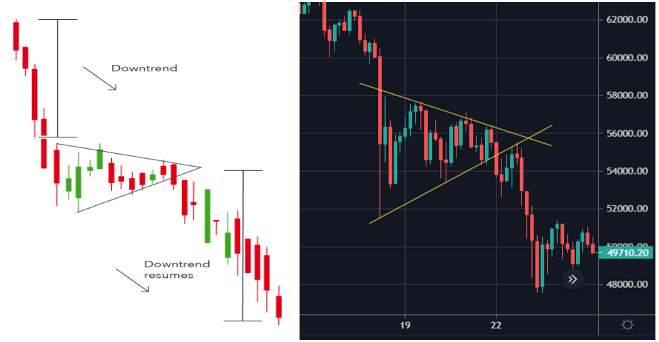
Symmetrical Triangles
Symmetrical Triangles are continuation chart patterns that are developed by two trend lines which converge. The symmetrical triangle pattern can be either bullish or bearish, depending on the market. In either case, it is normally a continuation pattern, which means the market will usually continue in the same direction as the overall trend once the pattern has formed. However, if there is no clear trend before the triangle pattern forms, the market could break out in either direction. This makes symmetrical triangles a bilateral pattern, meaning they are best used in volatile markets where there is no clear indication of which way an asset’s price might move.
8. Chart Patterns to Identify Market Manipulation
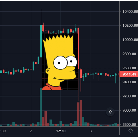
The “Bart Simpson” Pattern
When we look at the Bitcoin chart in small time frames, one can identify sudden movements or ‘bump’ in one direction, followed by consolidation and a sudden ‘bump’ in the other direction that ends close to the base price. This phenomenon has given the name “Barts” because the asset’s price pattern looks like the head shape of the iconic Simpsons character, Bart Simpson.
It is a familiar occurrence for Bitcoin, one noticed by investors time and again during volatile trading stretches. It appears as a result of hundreds-of-Bitcoin orders in a matter of minutes. The reason for these sudden pumps and dumps is likely to liquidate crypto margin traders, whether short or long, by manipulating the market. While some believe that this is done by the exchanges themselves, which is entirely possible due to the lack of regulations, this might be related to large crypto traders, commonly known as ‘whales.’
Wyckoff Pattern
The Wyckoff Pattern was first brought to light by Youtuber “Uncomplication” to unearth potential market manipulation by whales. The pattern was developed by Richard Demille Wyckoff, an early 20th-century pioneer in the technical approach to studying the stock market. The pioneering work of Richard D. Wyckoff was centered around the realization that stock price trends were driven primarily by institutional and other large operators who manipulate stock prices in their favor.
Wyckoff proposed a heuristic device to help understand price movements in individual stocks and the market, which he dubbed the “Composite Man.” Wyckoff advised retail traders to try to play the market game as the Composite Man played it. The Composite Man attracts the public to buy a stock in which he has already accumulated a sizeable amount. Wyckoff and his associates believed that if one could understand the market behavior of the Composite Man, one could identify many trading and investment opportunities early enough to profit from them. Using Wyckoff’s method, one can invest in stocks by capitalizing on the intentions of the large “smart money” interests, rather than being caught on the wrong side of the market.

The Bottom Line
Technical analysis can give cryptocurrency traders an insight into the past of crypto, facilitating future predictions. But sole reliance on technical analysis ignores sentiment or news. This is particularly problematic with cryptocurrency trading since factors like mining hash rates and governmental regulations can have significant impacts on the market.
Technical analysis is a method of analyzing the price movements of a security or asset over time. It uses charts and other tools to identify patterns and trends in order to make predictions about future price movements.
Technical analysis works by looking at past price movements and using these to predict future price movements. This is done by looking at patterns in the data such as support and resistance levels, trend lines, and chart patterns.
Technical analysis can be used to identify potential trading opportunities and to help traders make informed decisions. It can also help traders manage risk by identifying areas where they should exit their positions.
Support and resistance are levels on a chart where the price of an asset has difficulty either breaking through or falling below. These levels can be used to identify potential entry and exit points for trades.
A chart pattern is a specific pattern that appears on a chart. Common chart patterns include head and shoulders, double tops and bottoms, and triangles. These patterns can help traders identify potential trading opportunities.
Technical analysis can be used to identify potential trading opportunities in the cryptocurrency markets. By looking at past price movements, traders can identify patterns and trends that can be used to make predictions about future price movements.
Disclaimer: Cryptocurrency trading involves significant risks and may result in the loss of your capital. You should carefully consider whether trading cryptocurrencies is right for you in light of your financial condition and ability to bear financial risks. Cryptocurrency prices are highly volatile and can fluctuate widely in a short period of time. As such, trading cryptocurrencies may not be suitable for everyone. Additionally, storing cryptocurrencies on a centralized exchange carries inherent risks, including the potential for loss due to hacking, exchange collapse, or other security breaches. We strongly advise that you seek independent professional advice before engaging in any cryptocurrency trading activities and carefully consider the security measures in place when choosing or storing your cryptocurrencies on a cryptocurrency exchange.